
Imagine this scenario: Your manager walks over to your desk and hands you a massive spreadsheet containing tens of thousands of rows and dozens of columns. “We need to understand why our customer retention dropped last quarter,” they say. “And we need a summary of the core drivers by tomorrow morning.”
Panic sets in. You open the file, and looking at the endless grid of numbers feels like staring at a wall of matrix code. Where do you even begin?
In the academic world, Exploratory Data Analysis (EDA) is often taught as a leisurely, highly structured process where you map out every single variable just for the sake of curiosity. But in the real world of business, EDA is a high-stakes race against the clock. The faster you can explore a dataset, the faster you can deliver the actionable insights that influence critical leadership decisions.
The secret to finding insights faster isn’t about jumping straight into complex machine learning algorithms or writing 200 lines of code on day one. It is about having a systematic, aggressive strategy to interrogate your data. Here is a comprehensive, battle-tested framework to help you crack open any dataset and extract meaningful business insights in record time.
Begin with the End in Mind (Define Your Hypotheses)
The absolute biggest mistake most analysts make when handed a new dataset is diving straight into formulas, filters, and charts without a game plan. They get lost in a “data rabbit hole,” spending three hours tracking down a correlation that has absolutely zero impact on the company’s bottom line.
To move fast, you must start with hypotheses, not just numbers. Before you write a single line of SQL or create a single pivot table, close the laptop screen for five minutes and ask yourself:
- What specific business problem am I actually trying to solve?
- What does a “success metric” look like for this specific project?
- What are the most likely real-world culprits behind the issue we are seeing?
For example, if sales dipped, don’t just stare at the revenue column waiting for inspiration to strike. Formulate concrete hypotheses based on your business intuition: Did a specific product category underperform? Did a recent pricing update alienate a specific tier of customers? Was there a regional supply chain disruption that delayed deliveries?
When you start with a hypothesis, your data exploration ceases to be a random fishing expedition. Instead, it becomes a targeted mission to prove or disprove a specific theory. This mindset shift alone will cut your analysis time in half.
The 10-Minute “Sanity Check” (Advanced Data Profiling)
Before you start hunting for deep insights, you need to know exactly what kind of terrain you are walking into. Think of this as surveying a piece of land before you begin building a house. You need to assess the structural integrity of your dataset.
No matter what tool you prefer to use—whether it’s Python (Pandas), SQL, Power BI, or Microsoft Excel—your first ten minutes should always be dedicated to basic data profiling. Focus heavily on these four areas:
Check the Shape and Grain
How many rows and columns do you actually have? More importantly, what does an individual row represent? Is it a single transaction, an entire daily summary, or a unique customer profile? Understanding the “grain” of your data prevents you from making foundational math errors later on.
Identify and Fix Data Types
Are your dates properly recognized as dates, or are they being treated as random text strings? Are your financial metrics actually formatted as numbers? If your analytical tool thinks a date is just text, you won’t be able to perform time-series analysis or filter by month without running into annoying errors.
Spot the Gaps (Missing Values)
Look for NULL values, blanks, or NaN markers. A high percentage of missing data in a critical column—such as “Customer Region” or “Discount Applied”—will completely derail your analysis if you don’t catch it early. Decide immediately whether you need to fill those gaps with averages, flag them as “Unknown,” or drop those rows entirely.
Look at the Extremes (Min/Max and Outliers)
Scan the minimum and maximum values of your numerical columns. If you are analyzing an e-commerce dataset and see a product price of -$500, or a customer age listed as 197, you instantly know you have a data entry or system pipeline issue. Catching these weird anomalies early saves you from presenting skewed averages to your stakeholders later.
Clean Ruthlessly, But Focus on High Impact
Dirty data slows you down more than anything else. Duplicate rows, inconsistent naming conventions, and hidden trailing spaces will quietly ruin your calculations behind the scenes. However, because you are working under a tight deadline, you cannot afford to spend days perfectly polishing every single cell. You need to practice high-impact cleaning.
First, drop the noise. If a column has 80% missing values and has nothing to do with your core business question, delete it or hide it. It is nothing but visual clutter that drains your cognitive energy.
Second, standardize your categories. In raw datasets, you will often find messy text columns where the same entity is written in three different ways—like “US”, “USA”, and “United States”, or “jakarta”, “Jakarta”, and “DKI Jakarta”. Use quick find-and-replace functions, or write a clean SQL CASE WHEN statement to group these messy variations into unified, standardized buckets.
Third, eliminate duplicate rows. Ensure your primary identifiers (like Transaction ID or User ID) are truly unique. Duplicated rows double-count your revenue and artificially inflate your metrics, giving a false sense of optimism that will blow up in your face during a business review.
Leverage the Power of Segmentation (Don’t Trust Averages)
One of the most dangerous things an analyst can do is rely entirely on high-level aggregates. Averages lie. If you tell your leadership team that the average customer spending is $50, you might be completely masking the reality that half of your customers spend $5 and the other half spend $95.
To find real insights faster, you have to slice your data. Segmentation is where the actual business stories are hidden. Instead of looking at overall performance, break your metrics down by multiple dimensions:
| Dimension Type | Examples for Segmentation | What It Reveals |
| Temporal (Time) | Month-over-month, weekday vs. weekend, morning vs. night | Seasonality, peak traffic hours, behavioral shifts. |
| Demographic | Customer age brackets, industry type, company size | Who your high-value buyers are vs. low-margin users. |
| Geographic | Country, state, city, urban vs. rural | Regional demand variations or localized shipping issues. |
| Behavioral | Frequency of login, types of features used, payment methods | Feature adoption rates and signs of imminent customer churn. |
By comparing these segments against one another, anomalies and trends will naturally jump out at you. If you notice that Segment A is growing at a rapid 40% clip while Segment B is declining by 20%, you have suddenly discovered a concrete, actionable insight that your manager can actually use to adjust their strategy.
Visualize Early, Visualize Often
Human brains are simply not wired to detect subtle mathematical patterns by scrolling through raw rows of a spreadsheet. We are, however, incredibly efficient at spotting visual patterns, disruptions, and trends. Do not make the mistake of waiting until your final presentation slides to build charts. Use visualization as an active tool for data discovery.
At this exploratory stage, your charts do not need to look pretty, perfectly labeled, or beautifully color-coded. Quick, rough-and-dirty exploratory plots are your best friends:
- Histograms: Use these to instantly see the spread of your data. Is your customer base mostly young, heavily skewed toward older demographics, or evenly spread out?
- Scatter Plots: These are the absolute fastest way to spot relationships between two variables. For example, does a higher marketing spend on a specific channel actually correlate with a lower customer acquisition cost?
- Line Charts: This is your primary weapon for time-series data. It is the best way to quickly identify sudden performance drops, unexpected spikes, or repeating cyclical patterns.
If a chart looks completely flat or like a chaotic cloud of random dots, drop it and move on. But if you see a sudden, sharp cliff or an unexpected exponential curve, pause and dig deeper. That visual disruption is almost always the exact spot where a major business insight is hiding.
Apply the “So What?” Test
Once you have identified an interesting correlation or an unexpected trend, your job still isn’t quite done. Before you package your findings into a report, you must subject every single discovery to the ultimate intellectual filter: The “So What?” Test.
Let’s look at an example. Suppose you dig through an e-commerce dataset and discover that sales of blue phone cases spike significantly at 11:00 PM on Tuesday nights. That is certainly an interesting fact. It is a true pattern. But is it a valuable business insight?
To find out, ask yourself: So what? Why does this matter to the executives running this company? What concrete action can we take based on this information?
If a discovery doesn’t lead to a clear operational recommendation—such as shifting digital ad spend to Tuesday evenings, changing product placements, adjusting inventory levels, or launching a targeted email campaign—then it isn’t a true business insight. It’s just trivia. When you are racing against a tight deadline, protect your time fiercely by ignoring the trivia and focusing exclusively on findings that have the power to change how the business operates.
Shifting from Reactive to Proactive Analytics
Ultimately, learning how to explore a dataset faster is less about mastering complex mathematical equations and more about cultivating a structured, inquisitive mindset. Spreadsheets are a fantastic playground for initial exploration, but if you want to truly scale your analytical speed, you need to transition your workflows into automated, visual environments.
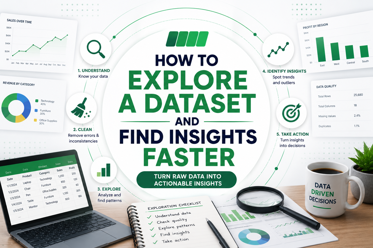
By establishing a repeatable internal framework—hypothesizing first, profiling the data structure, cleaning the high-impact errors, segmenting your populations, and using rapid visual discovery—you transform data analysis from a stressful, overwhelming chore into a highly predictable, efficient system. The next time someone hands you a massive, messy dataset, you won’t see a wall of confusing numbers. You will see a clear map waiting to be read.
Need Help Turning Your Spreadsheet into a Dashboard?
If you have spreadsheet data and want to turn it into a clean dashboard with clear KPIs and useful business insights, I would be happy to help.
Visit kenchristn.com to explore my portfolio and recent data analysis projects.
You can reach out for help with:
- Spreadsheet cleaning and preparation
- KPI planning
- SQL analysis
- Dashboard creation in Looker Studio
- Reporting with Microsoft Excel
- Turning business data into actionable insights
Let’s transform your spreadsheet into a dashboard that helps drive better decisions.