
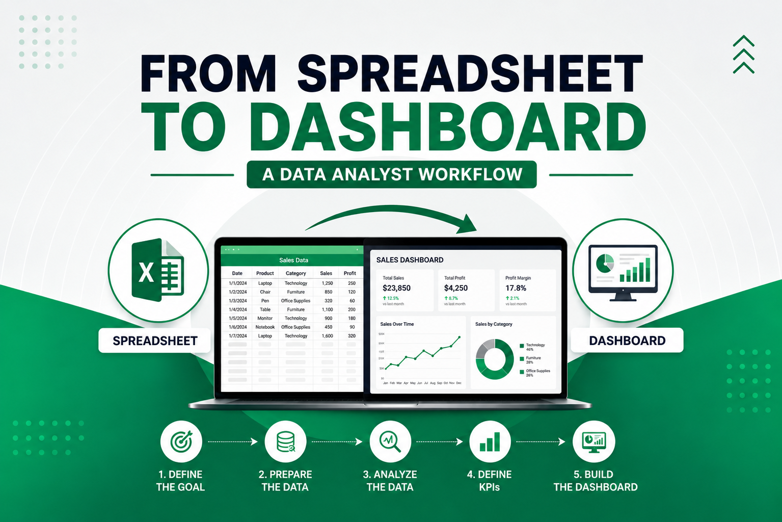
Data analysis often begins with something simple: a spreadsheet.
It could be a sales report exported from a system, an HR employee database, a list of customer transactions, or operational records collected over time. At first glance, spreadsheets may look straightforward, but anyone who has worked with real-world data knows that raw spreadsheets rarely arrive in a format that is ready for analysis.
Columns may be inconsistent, duplicate entries may appear, dates may be formatted differently, and important values may be missing. Before meaningful insights can be presented in a dashboard, the data usually needs to go through several steps.
This is where a structured data analyst workflow becomes important.
Moving from spreadsheet to dashboard is more than organizing numbers and building charts. It is a process of understanding business goals, preparing clean and reliable data, analyzing patterns, and presenting findings in a way decision-makers can understand quickly.
A good workflow creates consistency. It reduces errors, saves time, and helps transform raw data into actionable insights.
In this article, we will walk through a practical data analyst workflow—from spreadsheet preparation to dashboard creation—and explore real examples of how this process supports business decisions.
Why a Structured Workflow Matters in Data Analysis
Many data projects begin with urgency.
Someone asks for a sales report. A manager needs a dashboard before a meeting. A business owner wants to know why performance dropped last month.
It can be tempting to open the spreadsheet and start creating charts immediately.
The problem is that dashboards built too quickly often create confusion. When the underlying data is incomplete or inconsistent, the dashboard may look impressive while telling the wrong story.
A structured workflow helps avoid that.
It allows a data analyst to:
- Understand the objective before working with the data
- Clean and validate information before analysis
- Identify patterns accurately
- Build reports based on reliable metrics
- Present dashboards that are easier to interpret
Instead of reacting to numbers, the workflow creates a clear path from raw data to business decisions.
That structure becomes especially valuable when datasets become larger or when reports need to be updated regularly.
Step 1: Understand the Business Objective
Before touching the spreadsheet, the first question should always be:
What decision needs to be made from this data?
This step defines the direction of the analysis.
Without a clear objective, it is easy to create dashboards filled with charts that look useful but do not answer important questions.
For example:
A retail business may ask:
- Which product categories generate the most profit?
- How are monthly sales performing?
- Which customers contribute the most revenue?
An HR team may ask:
- How many employees are active?
- Which departments have higher turnover?
- What is the average employee tenure?
The answers determine what data matters and what KPIs should be tracked.
A dashboard becomes much more effective when it is built around business decisions rather than around available charts.
Step 2: Review the Spreadsheet Structure
Once the objective is clear, the next step is reviewing the spreadsheet.
This means understanding how the data is organized and identifying potential issues before analysis begins.
A spreadsheet review typically includes checking:
- Column names
- Data types
- Date formatting
- Duplicate rows
- Blank cells
- Inconsistent spelling
- Missing categories
- Numeric formatting
Example:
A sales spreadsheet may contain:
- Order ID
- Order Date
- Customer Name
- Product Category
- Quantity
- Sales
- Profit
- Region
At this stage, a data analyst asks:
- Are dates formatted consistently?
- Are product categories written the same way?
- Are sales stored as numbers or text?
- Are any records duplicated?
- Are there empty fields that could affect calculations?
Taking time here prevents issues later when creating formulas, queries, or visualizations.
Step 3: Clean and Prepare the Data
This is often the most time-consuming part of the workflow.
Clean data is the foundation of reliable reporting.
A dashboard can only be as accurate as the spreadsheet behind it.
Common data cleaning tasks include:
- Removing duplicate entries
- Standardizing date formats
- Fixing inconsistent naming
- Filling or handling missing values
- Converting text into numeric values
- Creating calculated columns
- Validating totals
Example:
A shipping dataset may have:
“Express Delivery”
“Express delivery”
“EXPRESS”
All of these should be standardized into one category.
Another example:
Date columns may appear as:
01/05/2026
May 1, 2026
2026-05-01
These should be cleaned into a single format for easier analysis.
Additional calculated columns may also be useful.
For example:
Shipping days:
Delivery Date – Ship Date
Profit margin:
Profit ÷ Sales
Age:
Current Year – Birth Year
These small preparation steps improve both analysis quality and dashboard performance.
Step 4: Explore the Data and Find Patterns
Once the spreadsheet is clean, analysis can begin.
This stage focuses on exploring the data and identifying trends, patterns, and anomalies.
A data analyst may start by asking:
- Which categories perform best?
- Are there unusual spikes?
- Which regions contribute the most?
- What changed compared to previous months?
Helpful analysis methods include:
- Pivot tables in Microsoft Excel
- Filtering and sorting
- Summary statistics
- Trend analysis
- Grouping categories
- SQL queries for larger datasets
- Quick charts for pattern review
Example:
A retail spreadsheet reveals:
- Technology has the highest total profit
- Office supplies have strong sales volume but lower margins
- Revenue increases significantly in Q4
These insights help determine what should appear in the dashboard.
Not every detail needs visualization.
The goal is finding the most relevant information.
Step 5: Define KPIs for the Dashboard
After exploration, key metrics become clearer.
This is where KPIs are selected.
A dashboard should focus on important numbers rather than every available metric.
Example: Sales dashboard
KPIs:
- Total revenue
- Total profit
- Average order value
- Profit margin
- Monthly growth
Example: HR dashboard
KPIs:
- Total employees
- Employee turnover rate
- Average age
- Department count
- Tenure
Choosing a focused KPI set helps dashboard users understand performance quickly.
A dashboard becomes easier to read when the first screen highlights the most important numbers.
Step 6: Build the Dashboard
Now the analysis turns into presentation.
A dashboard should make insights easy to understand at a glance.
The goal is clarity.
A strong dashboard often includes:
KPI cards
Examples:
- Total Revenue
- Total Orders
- Profit Margin
Trend charts
Examples:
- Monthly sales trend
- Revenue growth
Comparison charts
Examples:
- Sales by category
- Profit by region
Filters
Examples:
- Date range
- Category
- Region
- Department
Supporting detail
Examples:
- Top-performing products
- Lowest-performing regions
Popular tools include:
- Looker Studio
- Microsoft Excel
- Google Sheets
A clean layout matters.
Too many charts reduce readability.
A dashboard should guide attention naturally.
Start with top KPIs, then trends, then detailed breakdowns.
Real Example: Sales Data from Spreadsheet to Dashboard
Imagine receiving a spreadsheet from an online retail store.
It includes:
- Order ID
- Date
- Product
- Category
- Quantity
- Sales
- Profit
- Region
Business goal:
Understand sales performance and improve profitability.
Workflow:
Spreadsheet review
Found inconsistent date formatting and duplicate rows.
Cleaning
Removed duplicates and standardized categories.
Exploration
Discovered:
- Technology products generate highest profit
- East region has strongest revenue
- December sales increase significantly
KPI selection
Dashboard includes:
- Total revenue
- Total profit
- Average order value
- Monthly sales growth
Dashboard design
Visuals include:
- Revenue trend by month
- Profit by category
- Sales by region
- Top 10 products
Final result:
The business identifies high-performing categories, adjusts inventory planning, and focuses promotions more effectively.
A spreadsheet becomes a decision-making tool.
Common Mistakes to Avoid
Even with a workflow, mistakes happen.
Common issues include:
Skipping cleaning
Dirty data creates misleading dashboards.
Tracking too many metrics
Focus on the most useful KPIs.
Using too many visuals
More charts do not always improve clarity.
Ignoring the business objective
A dashboard should answer real questions.
Not validating totals
Always double-check calculations.
Small errors in spreadsheets become larger problems in reports.
Final Thoughts
Moving from spreadsheet to dashboard is one of the most practical workflows in data analysis.
It combines technical work with business thinking.
The process usually follows a clear path:
- Understand the goal
- Review spreadsheet structure
- Clean the data
- Explore patterns
- Define KPIs
- Build a dashboard
When done well, this workflow transforms raw spreadsheets into meaningful visual reports.
More importantly, it helps businesses make decisions faster with confidence.
A spreadsheet contains data.
A dashboard turns that data into a story.
And a good data analyst helps connect the two.
Need Help Turning Your Spreadsheet into a Dashboard?
If you have spreadsheet data and want to turn it into a clean dashboard with clear KPIs and useful business insights, I would be happy to help.
Visit kenchristn.com to explore my portfolio and recent data analysis projects.
You can reach out for help with:
- Spreadsheet cleaning and preparation
- KPI planning
- SQL analysis
- Dashboard creation in Looker Studio
- Reporting with Microsoft Excel
- Turning business data into actionable insights
Let’s transform your spreadsheet into a dashboard that helps drive better decisions.